Why is mobile design so important?
In the past few years, web developers, SEO enthusiasts, and experts have devoted immense attention to mobile design development and adapted SEO patterns. Google has, in line with that, made a push making mobile ranking immensely influential for the overall SEO strategy. The mobile-first ranking experienced its expansion after 2018 after the research that gave us insight into user preferences. Furthermore, the rise in smartphones means the way people access the internet has also evolved away from just desktops, resulting in 52.2% of all global web traffic being via mobile phones in 2018 alone.
Therefore, Google has stepped forward in its design and how to determine how to rank mobile pages and impact desktop counterparts. This blog will deal with this issue and elaborate on the importance of mobile design and its impact on SEO ranking, which is extremely important for website owners in any sphere.

Birth of mobile-first indexing
For an extended period, Google designers struggled with designing and determining mobile ranking. Before the current solution for this issue, Google had several failed designs to resolve it.
The main issue that appeared in all versions of the design was the appearance of duplicate content. Webmasters tried to change this by adding ‘rel=alternate’ and ‘rel=canonical’ links to the HTML of both pages. The main idea was to make mobile crawlers index and crawl pages without registering them as duplicates, and it seemed like a viable solution. Still, it didn’t last since it was prone to errors and required intensive resources, which encouraged masters to create another solution.
They came up with Critical Path rendering, which ordered internal and external page elements, to make certain sites were faster and more usable. But, once again, this idea resulted in many errors.
This evolution led to the design we have today, called Mobile-First Indexing. This solution is different because it alters the pre-algorithm evaluations and does not generate a new, separate index. Still, it changes how Google adds content to the existing index.
Why Mobile-First Index matter
Primarily because it changes how Google adds content, the Mobile-First index impacts your website’s overall Google ranking. Google ranking is precious for business owners who use websites to promote their products/services, and generally, content generates traffic. In addition, increased ranking draws more customers to note your business. To make the most use of this, business owners implement SEO features to their websites or hire experts.
What is SEO
Search Engine Optimization relates to the ranking of your website, or to be precise, the content you share on the website. Experts have developed strategies that help you improve your SEO index and rank higher on browsers pages, which is very relevant in several aspects. First, users tend to open the first few results on their browser’s page. Therefore the volume of traffic their site generates improves their chances of gaining new customers and increasing revenue. Additionally, the successful ranking of a page attracts people willing to pay you to be advertised on your website, which again reflects on your revenues. Therefore people tend to pay special attention to SEO. Some of the main elements that a page/blog article/product should have to be relevant for SEO index include:
- High-quality content
- Linking both internal and external
- Meta Description, Title Tags, Meta Descriptions, URLs, and Header Tags
- A well-optimized URL structure
- Videos and photos featured in the content
- Crawlability
- The Right Target Keywords
- Optimized Content
- Structured Data
The last SEO component, which is most relevant to our topic and has been increasingly important for overall SEO ranking, is mobile-friendliness, where Mobile-First Index comes to light.
Mobile-First Index
As mentioned, Google decided to tie the mobile index with an already existing one which in translation means that every web page that does not pass evaluation won’t be indexed, which eventually means no ranking. You should note that this does not exclude you from index or evaluation, but it impacts it immensely. Indexes are simply databases based on URLs and their structure, along with metadata and links to organize content, SEO matters. To avoid issues from the past, Google made its new algorithm rank to hire those websites that have user-friendly mobile versions.
Before dealing with its impact on SEO, it is essential to define that mobile-friendliness, in essence, includes an automatic adaptation of web content to the size of the mobile screen and reformatting the design to be more responsive. One of the defects is that this kind of design might take a longer time to develop. Still, management, support, and updates once linked are synchronized, which means all SEO benefits get automatically transferred. In this way, you attract customers and make them engaged at all times.
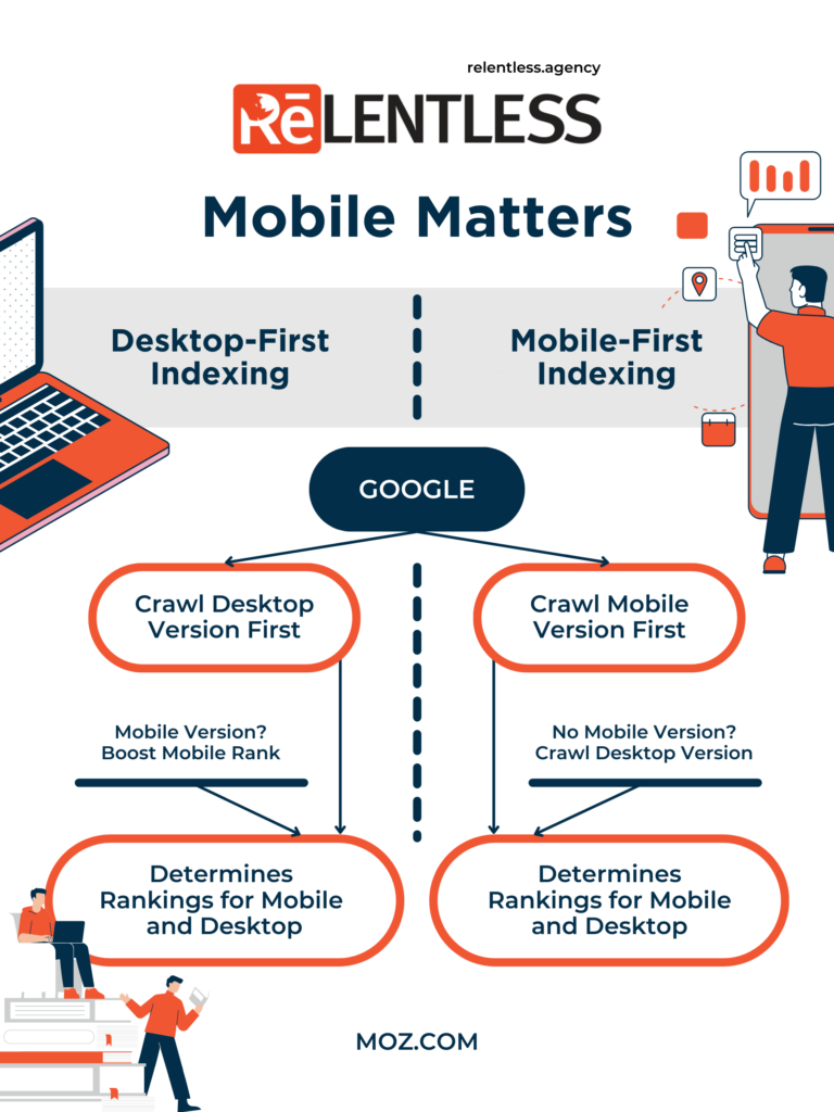
To further answer why you should pay attention to mobile design and why it is essential, we need to discuss the impact on User Experience and website load speed. Mobile-first precisely ensures that you deliver the right User Experience (UX), having in mind that in 2018 Eric Schmidt – Google CEO, announced that they’re using mobile-first indexing for over half of all web pages globally. So why does Google emphasize this form of design? Precisely because this technique separates content from design, it makes it much more efficient for Google to crawl and index the content.
Additionally, this approach steps away from the traditional URL index and focuses on speed, rendering, and engagement primarily carried by mobile experience, stepping its role one more time.
If we discuss SEO tactics and their distancing from URL, we should discuss schema and nested schema. These have been part of Google’s SEO recommendations because they provide an easy-to-crawl, entity-understanding of the content on the page. Schema helps you create a network of standards-based, machine-readable data across websites to better understand the content and content relationships without relying on links and URLs. This approach also points to the idea that Google has in the last years, which is essential to distance SEO from simple URL and make an effort to other spheres of content and website creation.
How to improve my design?
The increasing usage of mobile devices brought up patterns in which users who cannot navigate easily will spend less time on-site—using mobile-friendly elements such as a “sticky” header or a large site search bar, make the user experience better. Additionally, processing speed keeps getting faster, requiring mobile-friendly websites to become more crucial to a business’s success. Further on, we bring you some other advice to make your website mobile-friendly:
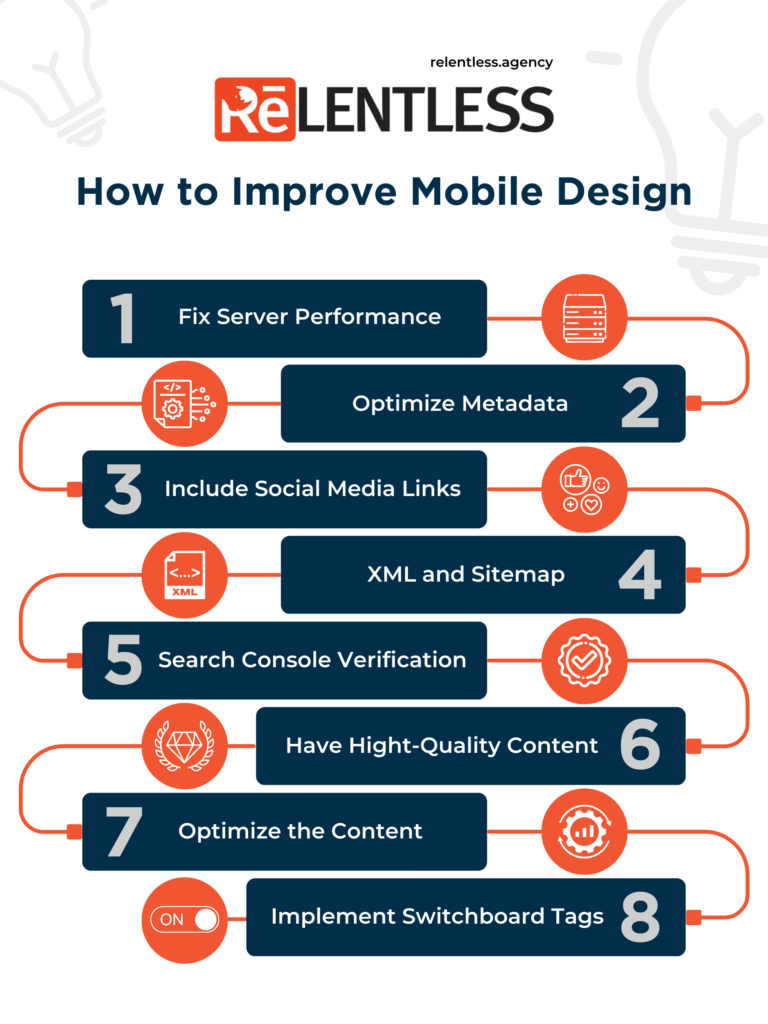
- Server performance must have the capacity to handle new crawl rates as your traffic grows.
- Metadata ensures that all titles and descriptions are equal on mobile and desktop versions.
- You should include social media links and metadata on the mobile and desktop versions. The disclaimer for structural data is that URLs shown within structured data on mobile pages should be the mobile version of the URL.
- XML and media sitemaps should ensure that any links to sitemaps are accessible from the mobile version of the site.
- Search Console verification should be available before the launch of your website so that you can monitor mobile design suggestions by Google’s search console.
- Content must include all of the high-quality, valuable content that exists on your desktop site.
- Optimization of content to make mobile titles for shorter character counts, but ensure to include the same information and relevant keywords.
- You should implement switchboard tags.
Final remarks
In the first place, Google has been significantly pushing for mobile design improvement to keep up with patterns that users develop, thus impacting web design. Therefore, Google seems mainly oriented toward Mobile designs.
Coming back to users, Google aspires to achieve the best user experience, which is why this new development model is encouraged.
After all of the mentioned benefits, it is easy to conclude that Google sees the future in Mobile-First Indexing and, therefore, in mobile design.
